Friday, 12 October 2012

Digital art:

This week so far:
I discovered an online drawing tool called scribbler, which is similar to DA Muro.
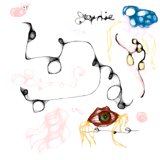
In the first image, I experimented with the widths and colours I could find on the pallet, cresting unique shapes in every turn I made.

You can see I've written half my name backwards, a jellyfish looking thing, a cat and an eye in lips with tentacles.


In this second image, I've focused on a more specific combination of widths and shades and created an actual object. I think. My inspiration was mainly a lily, or some sort of flower. However, I repeated the same petal shape as if it's growing and alive. It adds a lot of depth and flow to it. I really enjoyed this tool as it's results are unpredictable no matter where you direct the mouse and it can expand your imagination, even with mistakes.


Thursday, 31 May 2012

Fashion shoot! D;


how about we just ignore my face and the rest of my body on these and focus on my final piece I Made.


Thursday, 10 May 2012

Final Pieces

My final pieces for CAAD:


These are the tags that my fashion label would have; Glass Ocean. I think the images on the tags suit the style of the potential product (textiles final piece) well but something too detailed on something such as simple as a tag could detract from the textiles piece itself.


The bookmarks were fun to do as I myself read often and find it inconvenient not to have a bookmark. Not only does it have practicality but it's also a really nice addition to the set of designs I've created.             


The carrier bags would hopefully be made of paper as they're much more stylish than plastic bags and are also environmentally friendly which is a plus. 

I think that these designs fit in well with the final piece I have produced in textiles and that if they were potential items to be on the item/sold and holding the item in my theoretical shop it would make money and attract my target audience. (young people/surfers/coastal fans/etc)


Thursday, 26 April 2012

Thursday, 15 March 2012

From the previous list, I have deduced that the three designer labels I will be forwarding through my designs are:


(halfway through this post it decided not to save and not tell me so when i clicked to post this for some reason it asked me to sign in then it wouldn't let me post so eventually I have to type up all this stuff again so excuse me if it's half done.)


Topshop


It's slimline font says all it needs to. It doesn't need any decoration to add to itself as Topshop's reputation for fashionable products is known widely across the globe. 


Chanel


Femininity, classyness. Daintyness, french, romance. all the connotations of Chanel are really soft. Coco knew what she was doing.


Nike


More of a hands on brand but still has the reputation of the highest as it's very practical products are always made to the best standard.

Thursday, 1 March 2012

Designer Labels. What of them?

They're bland, and simple.


here's a few examples.


Topshop have the "really small sizing" thing going on. This should explain the slimline font and simplicity. They don't need their logo to be decorated, their products are.


(Personally, one of my favorites)


(Another one that I just love)


(my favourite of all time)


Thursday, 9 February 2012

Photoshop Progress: #2


This is the original image I am going to edit in the style of Sabrina Ward Harrison.


1. In this I started off with the "magic wand" tool where I cut out pieces of the background that I didn't need.


2. I inserted the image that I wanted to use in the background.


3. I then began experimenting with the "spot healing brush tool".


3. I had then inserted both images and used the spot healing tool throughout the majority of the image.


4. This is my final product. I am unsure I will be using this method in my final piece.


When going to screenshot it, I accidentally changed it to black and white. I prefer this outcome however, as it looks more vintage and classy. 


Photoshop Progress:


This is the original image of me that I used to edit in the style of Gherard Rhicter.


1. I started using the "smudge" tool to create a smooth and almost oily effect. 


2. I began to smudge from my cheekbones up to and around my eye sockets to ensure that I followed the lighting on my face correctly.


3. In this screenshot, you cans see that I've smudged the majority of the face and begun smudging my hair. Instead of leaving several gaps in my fringe I used the "eyedropper"tool, taking a colour of my hair and then using the "colour replacement" tool, giving my hair a fuller look.


4. In this I have developed the fringe's shading further, the block colour of grey becoming smaller as I add different bits of lighting to it. 

5. I then moved onto my scarf, something I   
 thought would be something else that I should edit and smooth out also.


6. This is my final outcome, a result I am happy with.